
Design System
One system behind four live products: this portfolio, Role Analyzer, the UX Design Briefing and the Kiro UX Auditor.
Four products had drifted into four copies of the same look
Every change meant updating them separately. So I audited the CSS first, then built one source of truth that all four load.
What I did
I started with an audit, not a palette: about 5,936 CSS declarations, 31 type sizes and 2,007 copied component declarations across the four products.
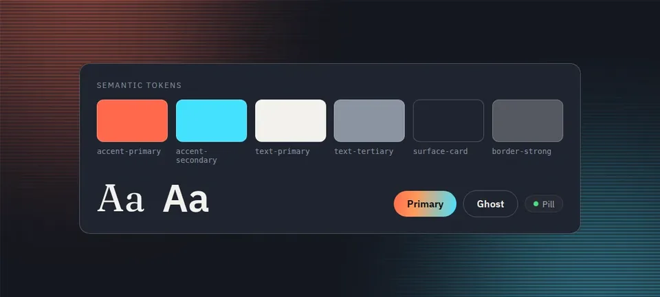
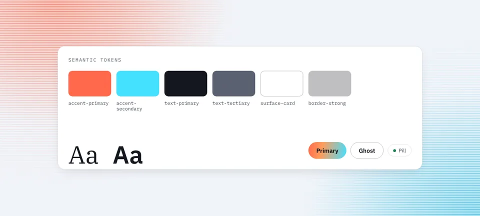
From that I built 236 tokens in the W3C design-token format, layered from primitives to semantic roles to component values, with a zero-dependency build, a validator that checks WCAG 2.2 contrast, CI and a decision log. A matching Figma library mirrors it: 189 variables, 12 text styles and 7 components. Then I migrated all four products onto the tokens. In v0.2.0 I added shared components (button, card, pill, tag, stat, step, check item and links, plus a set of 12 icons), documented in Storybook. The portfolio uses everything except the link styles. In v0.4.0 I added a light theme, and the portfolio now follows the visitor's system setting with a switch in the header.
How it works
Audit what exists
Count what the four products actually used before deciding what the system should contain.
Define tokens in layers
Primitives, then semantic roles, then component values, so a change at one layer carries through the layers above it.
Build and validate
A zero-dependency build outputs one CSS file that each product loads from a pinned release. A validator checks WCAG 2.2 contrast.
Migrate and record
Move the products over, first the tokens and then the components, and write down each decision in DECISIONS.md so the reasoning outlives memory.
Decisions that matter
31 type sizes cut to 10, with a 12px minimum text size.
44px minimum touch targets.
A border never changes a button’s height.
Dark mode only for now.
Every decision is recorded in the decision log, not left in my head.
Link, tap and focus defaults sit in a lower CSS layer, so a component’s own styles always win over page-level rules. I found this when a page rule turned the primary button’s text the wrong color.
Result: the portfolio’s shared CSS dropped from 2,445 to 1,915 lines, with about 1,740 duplicate declarations removed, and to 1,795 lines once it moved onto the shared components. The migration also fixed an unsafe way Role Analyzer displayed AI output.
Honest limits
Shared components arrived in v0.2.0, and only the portfolio uses them so far; it is also the only product with the light theme and the switch from v0.4.0. The other three products load the tokens and still keep their own copies of buttons and cards, and the header and footer are still copied between repos. Forms, tabs and tables are not built yet (forms are next, then tabs, tables and accordions). This is my own system across my own four products, not an organization adopting one.