

Pre-Select Meal Experience
Bringing one design direction to three touchpoints
Premium-cabin passengers could choose a meal in three places, and each one looked and worked differently. The request was a minimum feature. On the first day of the increment, I made the case for fixing the inconsistency too.
Results at a glance
The three touchpoints
Passengers could choose a meal in three places. Three different teams owned them, and each used its own layout and interaction pattern.
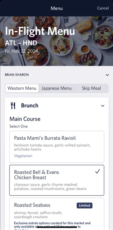
In-flight menu
The menu in the Fly Delta app, used onboard.
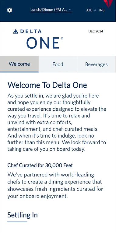
Landing page
The page passengers reach from the link in the email, on a third-party platform with limited flexibility.
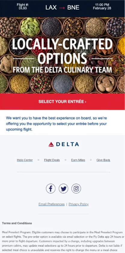
The reminder that invites passengers to choose a meal before the flight.
Problem & stakes
The same task looked and worked differently at each touchpoint.
Premium-cabin passengers chose their meals through three touchpoints: a landing page on a third-party platform with limited flexibility, the in-flight menu in the Fly Delta app, and reminder emails. Each looked and worked differently, which is not what a premium-cabin passenger expects.
The request at the time was a minimum feature. It did not include fixing the inconsistency, and three different teams owned the three touchpoints.
Process
I raised the issue at the start of the increment and proposed a direction.
Raising the problem
On the first day of the increment, in late September 2024, I showed product management the inconsistency and made a business case for doing more than the minimum feature. Product management agreed.
Designing two directions
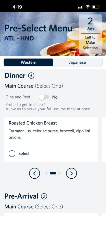
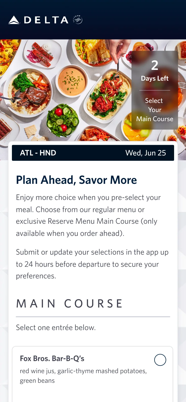
I designed two directions for the landing page. Option A followed the style of the in-flight menu, which had recently launched. Option B followed Delta’s next-generation customer-facing design system. That system was not finished, but I knew it was coming, so I designed toward it ahead of time. I proposed Option B. For both, I also designed the error and expiration states, which nobody had asked for yet, so we could see how each direction held up across the whole flow.
Developing the final version
I built high-fidelity interactive prototypes for the landing page and the in-flight menu, and applied the direction to email. After I moved to an advisory role in January 2025, I worked with the Omnichannel design team in Atlanta on the final version, Option C. That is the version that went live. My Option B did not go live as I proposed it.
From two directions to the final version
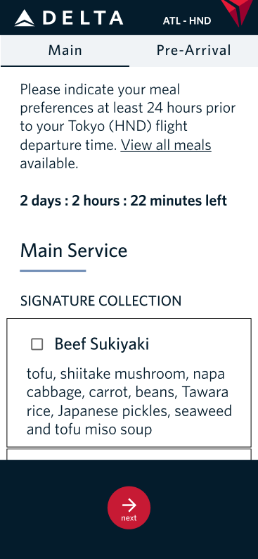
Option A
Followed the recently launched in-flight menu style
Option B · My proposal
Followed the direction of the next-generation design system, which was still in progress
Option C · Final version
Developed with the Omnichannel design team; went live
Trade-offs
The decision took about three months because it passed through several departments.
No one disagreed with the goal. Every department agreed that the experience should be consistent. But product, design, marketing, creative, and Omnichannel each had their own interests, deadlines, and ways of working, and the work passed through them one at a time.
Designing two directions took more time than designing one. I chose to do it so the teams could compare the options before a decision was made.
Outcome
Product leadership approved one direction for all three touchpoints, and the final version went live in 2026.
In late December 2024, product leadership approved the direction for all three touchpoints.
Delta’s Omnichannel design team adopted the direction, and Delta IT built it for production. I also shared the email direction with Marketing; I do not know whether they adopted it.
In January 2025, I moved to an advisory role and worked with the Omnichannel design team on the final version. I recommended a templated approach, which IT adopted to support the landing page, the in-flight menu, and the upcoming pre-purchase functionality. The front-end developer dedicated to the project estimated about two sprints to build the template, and about one week to build each touchpoint on it.
The final version, Option C, went live in the first quarter of 2026.
Reflection
I would set up shorter alignment checkpoints with product, design, marketing, creative, and Omnichannel early in the project, so the teams reviewed the work together rather than one after another.